Cofrinhos Redesign
Separating Card and Wallet contexts to give support operations a clearer, faster path to resolution.
Services
UX, Visual, Research, Product, Interaction design
Company
PicPay
Platform:
Herodash, an internal platform for the customer support team
My Role
Senior UX Designer - CX Wallet & Banking and Registration Squad
Collaborators: Product Management, Business Analysts (Wallet & Card), CX/Training team
Year
2025
Sites
Brazil

Context
PicPay's app offers two distinct types of "cofrinhos" (savings pockets), split across two business units — Wallet and Card:
-
Wallet cofrinhos — customers set aside part of their wallet balance and earn monthly yield.
-
Standard (102% CDI, up to 10 active cofrinhos)
-
Turbinado (121% CDI, running as two campaigns: a 1-year track and a 3-month track for eligible clients)
-
Shared — multiple people can contribute to the same cofrinho, with two optional rules: change rounding (Pix change is automatically saved into a configured cofrinho, with an optional multiplier) and recurring deposits (a scheduled automatic contribution)
-
-
Card cofrinhos — linked to the PP card; any amount saved becomes guaranteed credit limit (multiplied if the customer has the extra-limit feature). This cofrinho also yields after 30 days (since Feb 28) and accepts deposits via Pix or account balance.
-
Traditional card cofrinho — available to the full customer base
-
Cashback cofrinho — a rule change: cashback, previously applied as an invoice discount, is now saved into a redeemable cofrinho (withdrawals from $1). MVP scope: EPIC segment only; all other segments keep cashback as an invoice discount.
-
The goal was to give each BU (Card and Wallet) autonomy over its own cofrinho context, and enable accurate measurement of the real impact on human support.
Users
Customer support Analyst (N0) and Backoffice — both Card and Wallet.
Stakeholders
PM Wallet Cofrinhos, Wallet Analyst and Card Analyst, Data Business Analytics team.
Problem
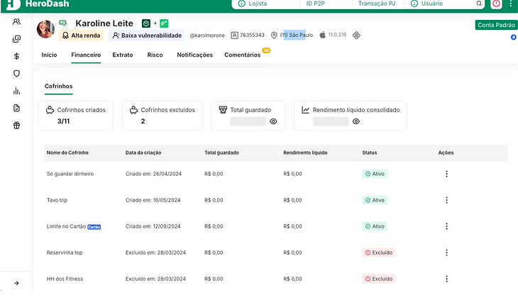
On Herodash, Wallet and Card cofrinhos currently appear mixed in a single listing. This impacts tracking, ticket segregation, and day-to-day usability for support operators.
The cost is measurable: 80% of cofrinho-related tickets that reach the Wallet team are actually about Card cofrinhos — a direct consequence of both topics living in the same menu.
The problem is also a scaling risk: with new cofrinho flows planned for launch by year-end (in both products), this confusion is expected to escalate further if the structure isn't addressed now.
Why act on this now:
-
There is currently no separation between the Card cofrinho (extra limit) and the Wallet cofrinho.
-
Operators need more autonomy to locate the correct cofrinho by BU, and the business needs to measure the real impact of this topic on human support.
-
With new cofrinhos planned on the roadmap, the current experience does not scale.
Operator pain points:
-
Difficulty locating Wallet and Card cofrinhos separately
-
Difficulty resolving and handling cofrinho-related tickets in the best possible way

Process
-
Research approach: Discovery, hypotheses validation, data analytics, app flow analysis, and a preference test.
-
1. Data & discovery
-
The CX team's ticket data — the 80% mis-routing figure — anchored the business case for separating the two contexts and was the starting evidence base for the initiative.


-
2. Preference test with frontline operators
-
As part of the redesign, a preference test was run through WikiPay, PicPay's internal training/knowledge channel, reaching operators across all support levels.
-
The method was chosen with the operation's full usage context in mind — from external BPO operators to the internal backoffice — to keep the research inclusive across every support tier without adding time to the average handling time (TMA).
-
Objective: understand which of 4 illustration combinations N0 BPO operators most easily associate with the two cofrinho types (Card and Wallet).
-
Research questions:
-
Which illustration is most easily recognized as a Card cofrinho?
-
Which illustration is most easily recognized as a Wallet cofrinho?
-
Which combination of images is most intuitive?
-
Hypotheses tested:
-
Operators already rely on card illustrations today to differentiate customer card tiers.
-
Illustrations (beyond tabs alone) can reduce operational errors.
-
Illustrations support findability, scanning, and identification between the two cofrinho types.
-
The pig icon, widely used across the PicPay app and ecosystem, is more easily associated with "cofrinho."
-
The pig-with-card illustration is the preferred image for recognizing a Card cofrinho.
-
Method: quantitative, unmoderated online preference test, published on WikiPay with a custom cover to stand out from other posts and drive engagement.
-
Sample: no formal sample-size calculation; open to all N0, N1, N2, and N3 support operators across every BPO location using the WikiPay platform.
-
Metrics tracked for the initiative: engagement, satisfaction, operational efficiency, TMA (average handling time), issue resolution, and lower-tier retention.
-
The preference test was conclusive and valid: 186 total votes, with Option 1 winning at 71 votes.
-
Timeline: published on WikiPay from July 25 to August 1, 2025.
-
Business rules defined with stakeholders
-
Preserve the operation's ability to see a client's total cofrinho sum despite the separation
-
Keep the existing rule of 10 cofrinhos per client, regardless of type (Card or Wallet)

Solution
-
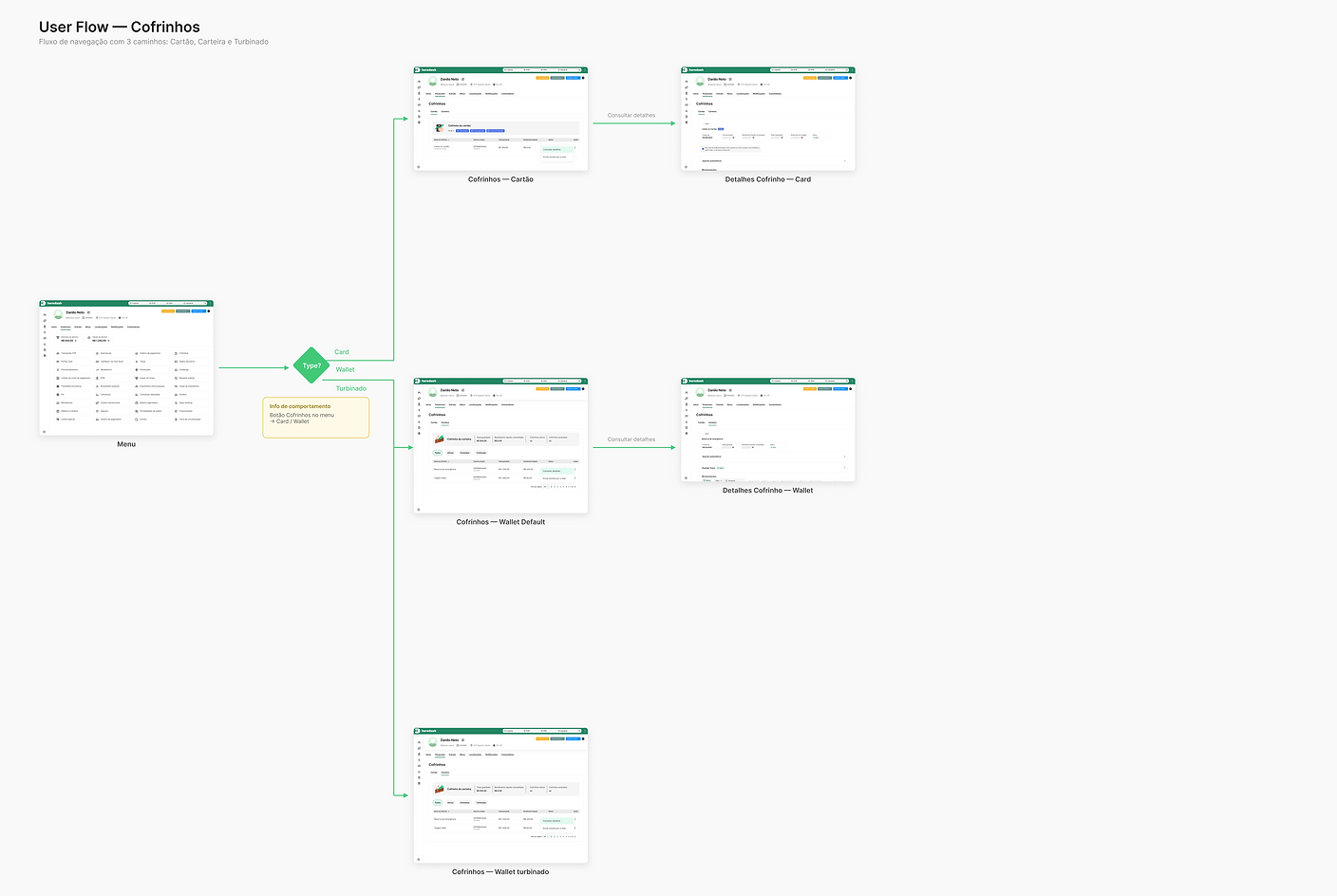
Full separation of Card and Wallet cofrinhos into distinct contexts on Herodash
-
New filters for Wallet cofrinhos
-
Navigation improvements on cofrinho detail pages
-
New functionality additions
-
Improvements to Wallet cofrinho detail views
-
The winning illustration set from the preference test applied to the redesign, giving operators a quick, consistent visual cue to tell Card and Wallet cofrinhos apart
The solution focuses on improving how support operators query cofrinho types on Herodash, and on building an experience that scales to future cofrinho types on the roadmap. The expected outcome is better findability and scannability, reflected in TMA and support efficiency.
UX goals:
-
Improve findability
-
Reduce cognitive load
-
Improve information architecture
These goals are expected to reflect in improved TMA, operational efficiency, and operator satisfaction.
User expectation: be able to clearly differentiate between the card limit and the total amount saved in Wallet.
Impact
Objective of the analysis: measure the results and success of the Cofrinhos redesign on Herodash — the separation of Card and Wallet cofrinho types — which went live between August 18–22, 2025.
Scope note: this study covers Wallet data only; Card data was not accessible for analysis. All figures below refer to the Cofrinho Padrão and Cofrinho Turbinado products.
Methodology — before/after comparison:
-
Metrics analyzed: incorrect tagging/routing, escalation (transbordo), issue resolution, NPS
-
Period covered: July, August, and September 2025
-
Comparison ranges: the month prior to the change (July); August split into two windows — Aug 1–17 (before) and Aug 18–31 (after); and the full closed month of September
-
Also tracked: overall contact rate and contact rate by level (BPO/N0 and Back Office); percentage of undue escalation from BPO to BKO; NPS and Issue Resolution per product
Results
Standard Savings
81,8%
Reduction in incorrect escalations
Reduced incorrect escalations from 1,807 to 930, improving routing accuracy across BUs. (e.g., card-cofrinho issues no longer misrouted to Wallet)
10%
Reduction in incorrect transfers.
48
Overall NPS improved from 29 to 48
69
Issue Resolution improved overall and within BPO, from 63 to 69
Results
Boosted Savings
81,8%
Reduction in incorrect transfers.
Incorrect transfers dropped sharply, from 44% in July to 8% in September, showing significantly more cases directed correctly
60
Issue Resolution
Issue resolution increased overall, in BPO, and in Backoffice, from 46 to 60
Outcomes
-
The chosen illustrations were adopted as the visual standard for differentiating Card and Wallet cofrinhos across the redesigned journey.
-
The research method itself — a lightweight, unmoderated preference test distributed through an existing internal channel (WikiPay) — validated a fast, low-friction way to involve frontline operators in design decisions without adding to their support workload.
Key
learnings
-
Frontline operators had already been informally relying on card illustrations to distinguish customer card tiers — a reminder that visual cues carry meaning in a workflow long before a formal design intervention arrives.
-
Illustrations work best as a support layer for findability and scanning; they complement structural separation (like tabs and distinct listings) rather than replace it.
-
Running research through a channel operators already use daily (WikiPay), instead of a dedicated research tool, meaningfully increased participation and made the operation feel part of the solution being built.